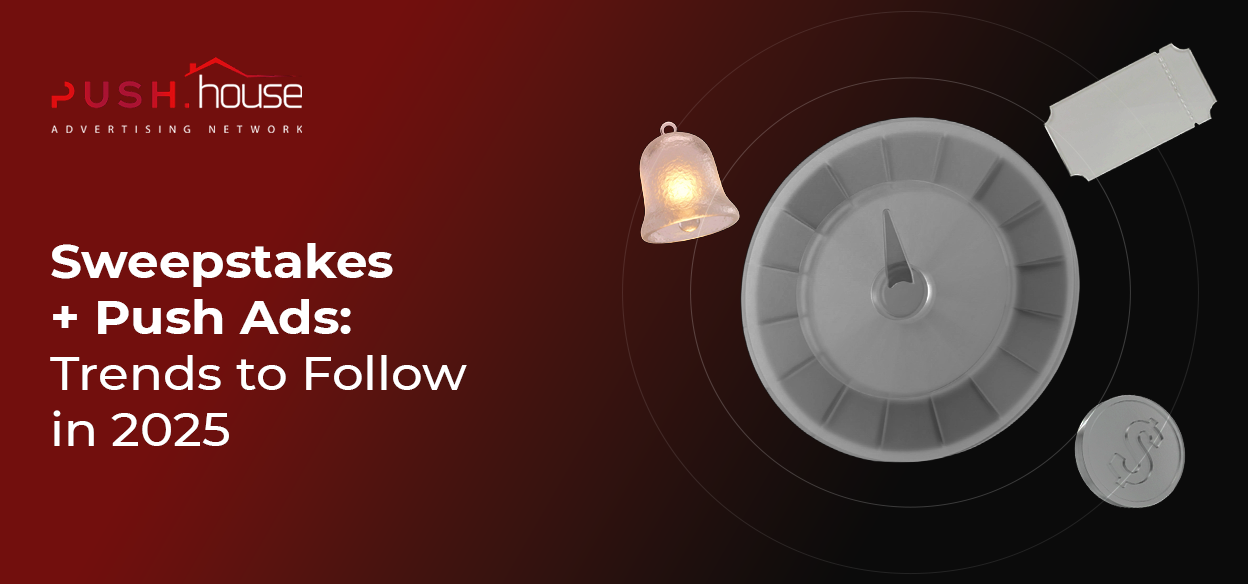
2025 Creative Trends for Sweepstakes
Sweepstakes remain an evergreen vertical, so presentation is everything. Creatives in 2025 are getting smarter — combining bold visuals with emotional triggers. Key trends:
The Prize
Show the reward: smartphones, laptops, coupons, gift boxes, etc.
Use a “gift” concept — e.g. a bright package image with the line: “Hey! You’ve got a surprise!” The goal is to make the user feel like they already won.
Personalized Messages
Direct, private-style messages work well:
“Congrats! You’re the winner!” or mock chat-style popups. Add a jury avatar or chat bubble overlay to create the illusion of a private prize notification.
Urgency & Scarcity
Add countdown timers or mention limited prizes.
Examples: “Win before the week ends!” or “Only 2 spots left!”
Urgency pushes the user to act now, not later.
Interactive Elements
Even images can suggest interactivity — like “spin to win” or “open your gift box.”
These prepare the user for engagement and boost curiosity before the form.
Social Proof
Add likes, comments, or testimonial overlays to creatives.
It builds trust: “If others got rewards, maybe I can too.”
Local & Timely Themes
Use country flags, local brands, or holiday tie-ins.
Example: time your iPhone giveaway with a local iPhone release or national holiday. That boosts relevance and CTR.
Don’t forget to test various creative combos. A/B testing your headline, image, copy, CTA makes a huge difference. Scale only the creatives that deliver high CTR/CR. Focus on a strong hook (short, punchy headline + bold CTA). Examples:
“🎁 Claim Your Gift”, “🚀 Get Your Reward”, “🕐 Win Before Time Runs Out!”
New Design Trends: Geometric shapes, 3D illustrations, infographic-style elements, and minimalist layouts are gaining popularity in ad design.
However, when it comes to sweepstakes, bold and vibrant visuals still win — think bright colors like red, orange, and yellow, plus large, eye-catching graphics. Subtle or transparent visuals tend to get lost in native-style push notifications.
Prelanders: Structure & Localization
In sweepstakes, prelanders are essential. They warm up the user, explain how the offer works, and motivate action.
A good prelander for sweepstakes should:
- Bold headline. It should immediately grab attention and highlight the main benefit. The headline needs to set the tone for an easy win.
- Prize image. A clear photo of the main prize (e.g., an iPhone or a gaming console) should be displayed prominently to showcase the value. Additional bonuses like coupons or discounts can be placed nearby.
- Urgency / scarcity. Always include a giveaway deadline or the number of prizes left. High-contrast colors and countdown timers help create a sense of urgency.
- Participation requirements. In the description, clearly list the steps needed to participate (e.g., fill out a form or answer a question), and explain what the prize gives (a discount, new product, or gift). The simpler and clearer — the better.
- Clear call-to-action (CTA). Your button or prompt should directly state what the user needs to do — for example: “Click to claim your prize” or “I’m in.” The CTA should leave no room for doubt.
- Simple form. The registration form shouldn’t overwhelm users with too many fields. The fewer fields (name, email, phone), the higher the conversion rate. Sometimes, forms are placed on the second page of the landing to first secure a click.
- Visual elements and animation. Bright icons, background animations, or realistic photos increase interest and bring the page to life. Just make sure not to overload it — instead, add interactive “growth points” (like a spinning wheel effect).
- Social proof. Display player reviews, comments, or logos of real partners. A common element is testimonial-style blocks with user photos and names — similar to social media posts. This builds trust by showing that others have already received their prizes.
✅ Prelander example layout:
- Headline: “Congrats! You’ve won!” or “Grab your iPhone before it’s gone!”
- Subheadline: “Stay on the page to claim your gift — only 2 hours left!”
- Main image: prize photo with bonus graphics
- Short requirements: “Fill in form → Enter draw → Win your prize”
- Countdown timer “1 day left”
- CTA button: “Get My Gift” leading to the final form
- Bottom of the page: realistic-looking comments and reviews, trust elements such as security badges and social media links
Common Mistakes Beginners Make and How to Avoid Them
- No testing.
Many beginners launch campaigns with just one or two creatives and start spending blindly, without checking performance. This often leads to wasted budgets.
Always start with A/B tests — compare different headlines, descriptions, and images. Without testing, you won’t understand why users are clicking — or why they’re not. - Ignoring localization.
A common mistake is using the same creatives across different countries.
For example, images with European currencies or unfamiliar brands may not work at all in Asia.
You need to adapt the language, numbers, and symbols for the local audience.
Don’t just do a literal translation — localize with the right cultural touch:
change names and photos in testimonials, switch prizes to something current (iPhone 11 won’t cut it — go with the iPhone 15 or another trending flagship).
If you mention discounts, show them in local currency. - Direct-linking to the landing page without a prelander.
Sweepstakes are a vertical where the “easy participation” model still needs warming up.
Beginners often drive traffic straight to the main offer landing page, skipping the prelander step — and end up losing a large chunk of traffic. - Generic creatives and spammy ads.
Copy-pasting someone else’s template without adaptation is a common trap.
Misleading or empty clickbait like “You’ve won!” (without showing the prize or how to get it) usually fails.
Avoid clichés and loud promises with no substance — they don’t engage. - Weak analytics and no optimization.
Some newbie affiliates don’t even use trackers.
You must set up a tracker and monitor CTR, CR, and CPA for every ad.
Without metrics, you won’t know where your budget is leaking. - Poor scaling strategy.
One of the biggest mistakes is greed: you see a positive ROI and instantly dump a bigger budget into the campaign — without optimization.
The right approach: don’t rush to scale.
Increase your bids gradually (by 10–15% per day), and duplicate campaigns instead of going all-in at once.
If you suddenly multiply the budget x5, your CPL might spike, or the system might throttle delivery due to unstable signals.
By avoiding these mistakes — and following real trends and expert advice — you’ll be able to build high-performing push campaigns for sweepstakes in 2025. Good luck — and high conversions!